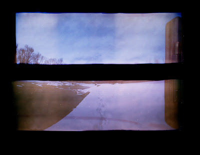


 After much tampering and trouble shooting i finally figured out the red bands on the negs. i still have a few minor things to work out such as small light leaks and fogging when removing film from the camera. beside all of that let me know what you think of the images themselves. these are pretty much just straight scans, keep that in mind. any and all input is greatly accepted.

8 comments:
Hey Ian. As far as composition goes, I particularly like the first and third images. They make me want to see the horizon line the most (is that what you're going for?) and cause me to imagine it and my mind fills in the blank. I especially like the footprints in the snow on the first image and the weeds or whatever they are in the third image. These things lead me into the image and up to where the horizon line should be.
I agree with what Leslie said but I also love the mood of the fifth image. Good start.
I think the uneven strip lengths on the second image is really interesting. Maybe you could play up on that, too.
I like the sun flares and the intense blue cast in a few of these
why are the doors and hinges in some but not others. i understand that they might not be open enough but the hinge is immovable so is it the positioning on the film that decides whether they register or is it editing?
the door is in some and not others because it was either at the end of the roll or the beginning and the fill wasnt long enough to capture it. im trying to keep flipping the side at which it is on so as to try and keep things from getting to repetitive. thanks for you comments i really appreciate it.
I think these are working well, especially top and bottom 2.
I really like the ones where the door is on the left side. For me it's not too repetitive. It makes me feel like I'm inside the box, and your taking me to see these beautiful places. This is such a cool project.
I like where this is going. I would suggest playing with the idea of having something span both strips, i.e. the first and third images. Having a visual link between the images makes them much more successful to me.
Post a Comment