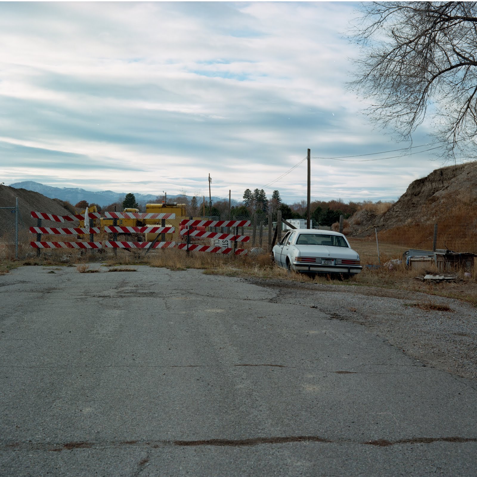
the bottom one lends itself more to your project i think...maybe because it is more about the destination or stopping point represented by the roadblock and sense of place through the foreground and sky. the top one is, for me, more about the car AND the roadblock AND the tree AND the hills in the background and less about where Google decides to drop you off at...ya dig?
I think that the bottom one is most effective-- I hit the end of the road a little ways up the asphalt (when I stop at the fence and wrecked car and hill and striped barriers).
i agree with what hunter said, but i find the top image a far better composition. like Ian said, there is too much foreground. I really like the foreground detail in the top one.


5 comments:
the bottom one lends itself more to your project i think...maybe because it is more about the destination or stopping point represented by the roadblock and sense of place through the foreground and sky. the top one is, for me, more about the car AND the roadblock AND the tree AND the hills in the background and less about where Google decides to drop you off at...ya dig?
I was going to say the first. But I don't know what your project is about so maybe you should listen to Hunter, or summarize for me :D
Top one for me. Bottom one has too much foreground space that is not active.
I think that the bottom one is most effective-- I hit the end of the road a little ways up the asphalt (when I stop at the fence and wrecked car and hill and striped barriers).
i agree with what hunter said, but i find the top image a far better composition. like Ian said, there is too much foreground. I really like the foreground detail in the top one.
Post a Comment